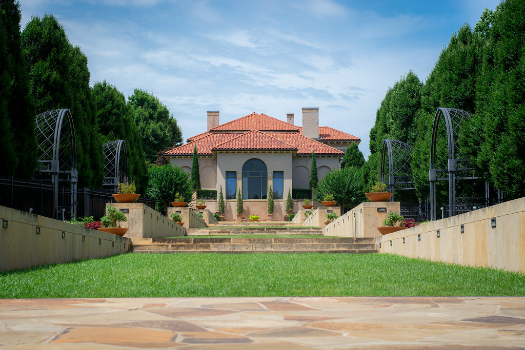
There’s nothing subtle about the title of this week’s post: it’s simply an outdoor view of the Philbrook Museum (the location of last week’s Joy in the Water photo) taken at the south end of one of its terraced walkways. As my wife and I were walking the grounds I kept looking for interesting photo opportunities and even though this one is somewhat pedestrian and even a bit boring, I like how it turned in a compositional sense. The subject is squarely in the center, and the lines of trees as well as the stone terraces all serve to draw your eye to the house-turned-museum. And even though the overall symmetry of the image might seem kind of boring, I think it’s kind of pleasing. I thought about going for a different perspective but…
a) I didn’t want to spend all afternoon trying to capture the ideal shot
b) I liked this composition just the way it was
c) It was about 100 degrees outside and we really wanted to get back to the air-conditioned interior
I focused on the windows and shot at f/5.6 to get things nice and sharp, and thanks to a ton of light I was able to use ISO 100 and a fast shutter to avoid any blur from an unexpected breeze. You also can’t see it but right behind me is a fountain and I originally shot a few pictures with that in the center, but it created a weird distracting column of water right where I wanted the viewer to focus on the house. So maybe that counts as trying a different perspective? I dunno. Either way I’m happy with this shot and it might, just might, end up printed and in a frame on our wall someday :)

David says
Simon – Well done! This photo looks like one that would be used for a promotional flyer advertising the Philbrook Museum. Three comments: First, the composition is classic and fundamental. It is right out of the primer on how to position yourself and set up your shot for a building that is the subject of the photo. Secondly, the blue sky. You say you enhanced it somewhat in Photoshop. Could the blue color of the sky have been properly enhanced by using a filter? Circular or Neutral Density or some other? I apologize for asking, but I am a beginner and learning more everyday about photography. Lastly, each week you surprise me with what can be done with a 50mm lens! It is really quite versatile. The zoom feature on a fifty is apparently your two legs! Thank you for your effort in putting up this site. Have a blessed day.
Simon says
Thank you, David! As always, I greatly appreciate your kind words :) I’m glad you like the classic composition here, though I can’t take much credit: all I did was stumble upon a good place to stand; the designers of the museum veranda are the ones who really knew what they were doing when they created this scene!
Regarding the sky, the RAW image was kind of blown out and most of the sky was white, which was a result of me exposing the image for the building and trees. The color data was still there, but I had to coax it out a bit by lowering the highlights and adjusting the saturation. It could have definitely been helped by using either a polarizing or neutral density filter, neither of which I had on me :(
I’m glad you enjoy visiting the site each week, and it’s people like you who give me all the motivation I need to keep doing this. I’m just a guy with a camera who likes learning, and each week I feel like I learn new things just by going out and taking pictures…
Carolana R. says
I am a novice photographer and I always learn so much from your weekly shots. I especially like the fact that you are showing us what can be accomplished with the “nifty-fifty.” Your explanation of the “why” and “how” of the photo is very helpful. Thank you!
Simon says
I’m also a complete novice when it comes to photography, Carolana :) I’m glad you like the photos here!